


Shot maps can be a great way to picture shooting locations in a visually pleasing format.
As opposed to the most common shot map visualizations out there, in this tutorial, we'll be focused on creating a tiled shot map. This chart will help us understand a team's most dangerous shooting areas instead of looking at individual shot locations.
Here's an example of a tiled shot map and what we'll be attempting to recreate.
Where do Europe's top scorers shoot from? 🇪🇺
— Son of a corner (@sonofacorner) May 31, 2022
Interesting that Son has the most attempts OTB (24.4%), whereas Haaland is the player with the least long-distance shots (2.5%). 🤔
(This is a correction from a previous tweet, thanks @Sam__Radford @elliott_stapley ) 🙃 pic.twitter.com/ezUKqC8gws
What we'll need
As in previous tutorials, I'm assuming that you at least have some basic knowledge of matplotlib and pandas.
To start, please ensure you have installed the mplsoccer package, which we will use to draw the football pitches.
Note: if you're using Google Colab you should run the following line at the top of your notebook, to ensure we're using the same matplotlib version.
!pip install matplotlib --upgradeimport pandas as pd
import matplotlib.pyplot as plt
import matplotlib.ticker as ticker
import matplotlib.patheffects as path_effects
# We'll only use a vertical pitch for this tutorial
from mplsoccer import VerticalPitchThe data
On this occasion, I'll make a ton of data available so you can play around with different players and teams to create your visualizations.
The csv file contains over 25 thousand shots made by all Championship players from the past two seasons.
Edit: I made a change in the dataset to add an additional column to identify own goals.
Once you've read the DataFrame your data should look something like this.
df = pd.read_csv("efl_championship_shots_07022022.csv", index_col = 0)| | matchId | playerName | playerId | min | x | y | shotType | blocked | onTarget | xG | xGOT | eventType | teamId | teamColor | date | teamName |
|---:|----------:|:---------------|-----------:|------:|--------:|--------:|:-----------|:----------|:-----------|-------:|-------:|:-------------|---------:|:------------|:--------------------|:-----------|
| 0 | 3414536 | Cauley Woodrow | 282276 | 4 | 93.7 | 14.2604 | RightFoot | False | False | 0.0609 | nan | Miss | 8283 | #881018 | 2020-09-12 16:00:00 | Barnsley |
| 1 | 3414536 | Alex Mowatt | 488624 | 10 | 77.3044 | 25.9962 | LeftFoot | False | False | 0.028 | nan | Miss | 8283 | #881018 | 2020-09-12 16:00:00 | Barnsley |
| 2 | 3414536 | James Collins | 189075 | 18 | 95.0614 | 37.05 | LeftFoot | False | False | 0.2792 | nan | Miss | 8346 | #002858 | 2020-09-12 16:00:00 | Luton Town |
| 3 | 3414536 | Alex Mowatt | 488624 | 25 | 83.4985 | 33.7713 | RightFoot | True | True | 0.0281 | nan | AttemptSaved | 8283 | #881018 | 2020-09-12 16:00:00 | Barnsley |
| 4 | 3414536 | Callum Styles | 748856 | 25 | 94.5789 | 48.9753 | LeftFoot | False | False | 0.0324 | nan | Miss | 8283 | #881018 | 2020-09-12 16:00:00 | Barnsley |Great. Notice that in this case, I've provided the data in a raw format, so we'll need to do a couple of calculations to make it dance.
In this tutorial, I'll analyze the data at an aggregated level. That is, I'll be exploring the locations from where each side generated its most dangerous on-target shots (xGOT).
Dividing the pitch
Before we start playing around with our dataset, we must understand how to draw a pitch in matplotlib and how each data provider's coordinate system works.
To start, let's draw a basic pitch using the VerticalPitch class we imported from the mplsoccer package.
fig = plt.figure(figsize = (4,4), dpi = 100)
ax = plt.subplot(111)

pitch = VerticalPitch()

pitch.draw(ax = ax)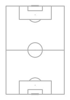
Pretty easy, right?
Now, let's look at the underlying coordinates used by each data provider to get a better sense of what we need to do to plot our data.
fig, axes = plt.subplots(nrows = 1, ncols = 3, figsize = (8,5), dpi = 100)

providers = ["opta", "statsbomb", "uefa"]
for index, ax in enumerate(axes.flat):
    pitch = VerticalPitch(
        pitch_type = providers[index],
        axis = True,
        label = True,
        tick = True
    )
    pitch.draw(ax = ax)

    # So we can view more ticks in the chart
    ax.xaxis.set_major_locator(ticker.MultipleLocator(15))
    ax.yaxis.set_major_locator(ticker.MultipleLocator(15))

    ax.set_title(providers[index])

plt.subplots_adjust(wspace = 0.75)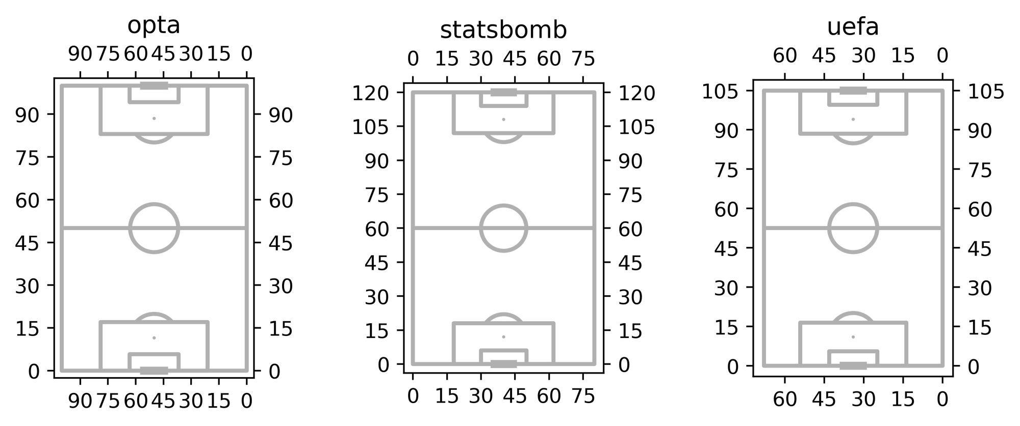
In our case, we're working with a UEFA pitch type defined in meters, 105 meters wide by 68 meters high.
Note that the x and y axes are inverted since we have a vertical pitch.
To dip our toes in the water, let's plot a hypothetical shot in our UEFA pitch and draw a red line on the edge of the 18-yard box (~16.5 meters).
fig = plt.figure(figsize = (4,4), dpi = 100)
ax = plt.subplot(111)

# Notice the extra parameters passed to the object
pitch = VerticalPitch(
    pitch_type = "uefa",
    half = True,
    axis = True,
    label = True,
    tick = True,
    goal_type='box'
)

pitch.draw(ax = ax)
# Hypothetical shot.
ax.scatter([45],[93], s = 30)
# The coordinates of the 18-yard box
x_end = 68 - 13.84
x_start = 13.84
y_position = 105 - 16.5
ax.plot([x_start, x_end], [y_position, y_position], color = "red", ls = ":")
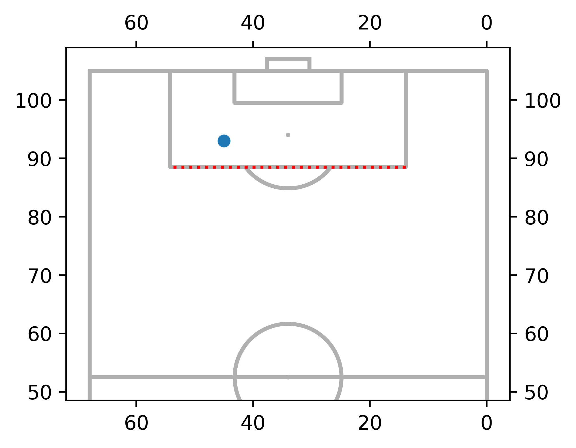
Excellent, now we have a better sense of what's going on.
For the next part, we'll divide our pitch into the set of areas that we're interested in analyzing, and we'll write our code as a function so we can use it later.
Please note that the mplsoccer package already has built-in methods to do this, but I want to show you how this (maybe) works behind the scenes. Plus, it's more fun 😅.
def soc_pitch_divisions(ax, grids = False):
    '''
    This function returns a vertical football pitch
    divided in specific locations.

    Args:
        ax (obj): a matplotlib axes.
        grids (bool): should we draw the grid lines?
    '''

    # Notice the extra parameters passed to the object
    pitch = VerticalPitch(
        pitch_type = "uefa",
        half = True,
        goal_type='box',
        linewidth = 1.25,
        line_color='black'
    )

    pitch.draw(ax = ax)

    # Where we'll draw the lines
    if grids:
        y_lines = [105 - 5.5*x for x in range(1,10)]
        x_lines = [68 - 6.8*x for x in range(1,10)]

        for i in x_lines:
            ax.plot(
                [i, i], [45, 105],
                color = "lightgray",
                ls = "--",
                lw = 0.75,
                zorder = -1
            )
        for j in y_lines:
            ax.plot(
                [68, 0], [j, j],
                color = "lightgray",
                ls = "--",
                lw = 0.75,
                zorder = -1
            )

    return ax
Let's see if it works.
fig = plt.figure(figsize = (4,4), dpi = 100)
ax = plt.subplot(111)

soc_pitch_divisions(ax, grids = True)
B E A utiful 😍
Back to the data
Now that we have defined the areas through which we'll be dividing the pitch, we can now get back to our DataFrame and aggregate the xGOT created by each side in each location.
First, notice that since we'll be using a vertical pitch, we'll need to invert the coordinates in our df. Plus, we can also define the points that divide each of our bins for both the x and y axes.
# Keep only most recent season data
df = df[df["date"] >= "2021-08-06"].reset_index(drop = True)

# We need to invert our coordinates
df.rename(columns = {"x":"y", "y":"x"}, inplace = True)

# We define the cuts for our data (same as our pitch divisions)
# Only difference is we need to add the edges

y_bins = [105] + [105 - 5.5*x for x in range(1,10)] + [45]
x_bins = [68] + [68 - 6.8*x for x in range(1,10)] + [0]

x_bins.sort()
y_bins.sort()
Next, we use the pd.cut() method to segment the shots into bins, and finally, we group our df and sum the xGOT created by each side.
df["bins_x"] = pd.cut(df["x"], bins = x_bins)

df["bins_y"] = pd.cut(df["y"], bins = y_bins)

#Group and sum xGOT by side and location
df_teams = (
    df.groupby(
        ["bins_x", "bins_y", "teamName", "teamId", "teamColor"],
        observed = True
    )["xGOT"].sum()
    .reset_index()
)

# And we sort it based on the bins_y and bins_x columns
df_teams = (
    df_teams.
    sort_values(by = ["bins_y", "bins_x"]).
    reset_index(drop = True)
)
In the end, your new df_teams DataFrame should look something like this.
|    | bins_x       | bins_y       | teamName             |   teamId |   xGOT |
|---:|:-------------|:-------------|:---------------------|---------:|-------:|
|  0 | (27.2, 34.0] | (45.0, 55.5] | AFC Bournemouth      |     8678 | 0      |
|  1 | (27.2, 34.0] | (45.0, 55.5] | Fulham               |     9879 | 0.0161 |
|  2 | (27.2, 34.0] | (45.0, 55.5] | Millwall             |    10004 | 0      |
|  3 | (27.2, 34.0] | (45.0, 55.5] | Stoke City           |    10194 | 0.2745 |
|  4 | (27.2, 34.0] | (45.0, 55.5] | West Bromwich Albion |     8659 | 0      |
Almost there...
Ok, we got the data and the basics of the pitch design covered. Now it's time to fill the areas we defined with each team's data.
To achieve this, we'll use the fill_between() method and the alpha parameter to represent the shooting quality of each team.
Let's do this for Luton Town as an initial example.
- First, we filter the team and compute its total xGOT.
- Next, we divide the amount of xGOT of each bin by the total xGOT.
- Finally, we normalize the data based on the maximum value to get a scale from 0 to 1 for the transparency parameter.
example_df = df_teams[df_teams["teamName"] == "Luton Town"]
total_example = example_df["xGOT"].sum()

# Compute share of xGOT as a % of total
example_df = (
    example_df
    .assign(xGOT_share = lambda x: x.xGOT/total_example)
)
# Scale data to the maximum value to get a nice color scale
example_df = (
    example_df
    .assign(xGOT_scaled = lambda x: x.xGOT_share/x.xGOT_share.max())
)
Time for the viz 🎨.
Since we're using a pandas.Interval object for our bins, it's fairly easy to specify the area that needs to be covered.
In the end, all we need to do is iterate over our example_df and pass the lower and upper bounds of both the X and Y bins we previously computed, as well as the scaled xGOT value to the alpha parameter.
fig = plt.figure(figsize = (4,4), dpi = 100)
ax = plt.subplot(111)

soc_pitch_divisions(ax, grids = True)

counter = 0
for X, Y in zip(example_df["bins_x"], example_df["bins_y"]):
	#This colours our bins
    ax.fill_between(
        x = [X.left, X.right],
        y1 = Y.left,
        y2 = Y.right,
        color = "#495371",
        alpha = example_df["xGOT_scaled"].iloc[counter],
        zorder = -1,
        lw = 0
    )

    # Fancy annotations cuz why not?
    if example_df['xGOT_share'].iloc[counter] > .02:
        text_ = ax.annotate(
            xy = (X.right - (X.right - X.left)/2, Y.right - (Y.right - Y.left)/2),
            text = f"{example_df['xGOT_share'].iloc[counter]:.0%}",
            ha = "center",
            va = "center",
            color = "black",
            size = 5.5,
            weight = "bold",
            zorder = 3
        )

        text_.set_path_effects(
            [path_effects.Stroke(linewidth=1.5, foreground="white"), path_effects.Normal()]
        )

    counter += 1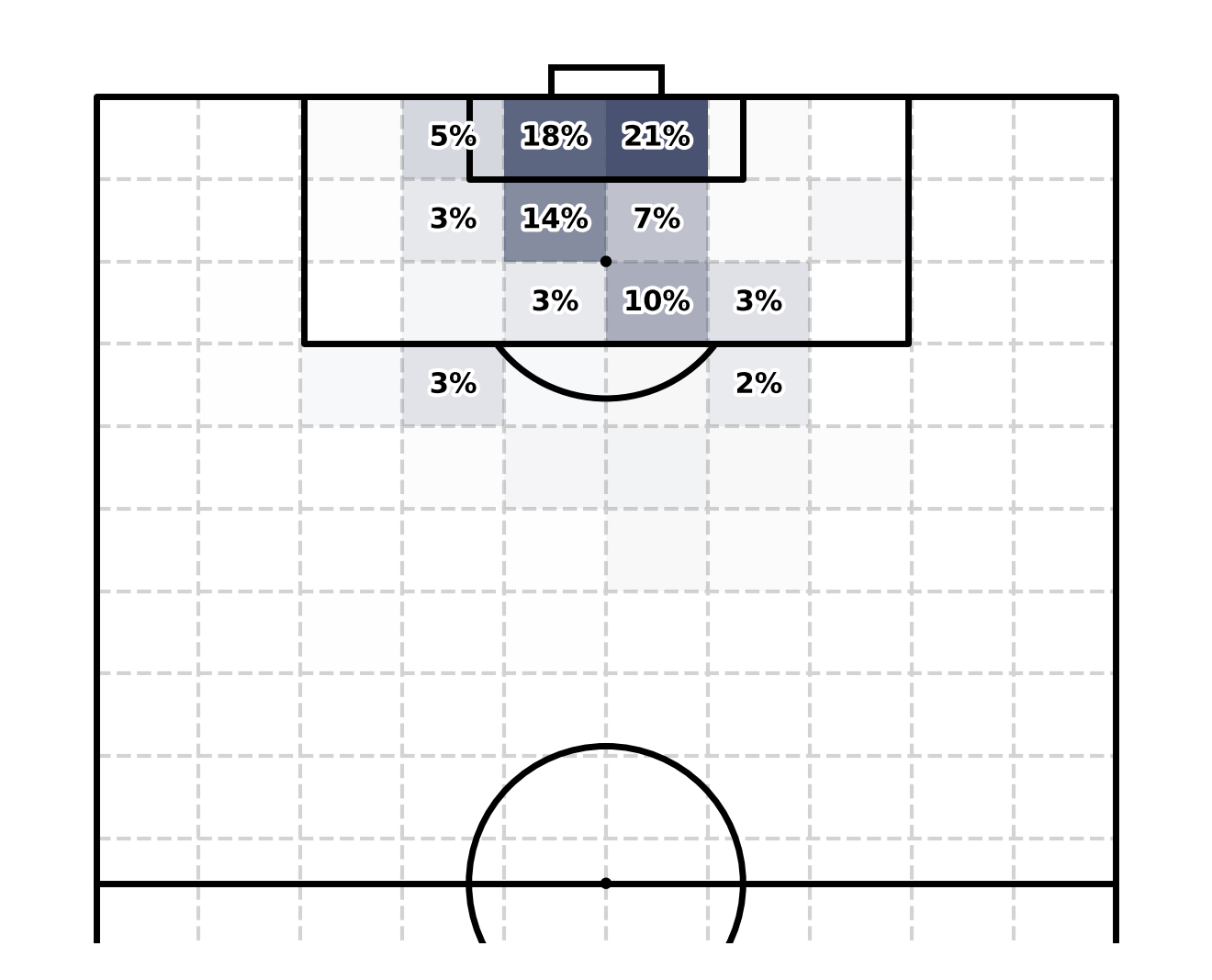
😘😘😘😘😘
Finally, we wrap things up into a function.
def soc_xGOT_plot(ax, grids, teamId, data = df_teams):
    '''
    This plots our shot heat map based on the grids defined
    by the soc_pitch_divisions function.

    Args:
        ax (obj): a matplotlib Axes object.
        grids (bool): whether or not to plot the grids.
        teamId (int): the teamId of the side we wish to plot.
        data (pd.DataFrame): the data
    '''

    df = data.copy()
    df = data[data["teamId"] == teamId]
    total_xGOT = df["xGOT"].sum()

    df = (
        df
        .assign(xGOT_share = lambda x: x.xGOT/total_xGOT)
    )
    df = (
        df
        .assign(xGOT_scaled = lambda x: x.xGOT_share/x.xGOT_share.max())
    )

    soc_pitch_divisions(ax, grids = grids)

    counter = 0
    for X, Y in zip(df["bins_x"], df["bins_y"]):
        ax.fill_between(
            x = [X.left, X.right],
            y1 = Y.left,
            y2 = Y.right,
            color = "#495371",
            alpha = df["xGOT_scaled"].iloc[counter],
            zorder = -1,
            lw = 0
        )

        if df['xGOT_share'].iloc[counter] > .02:
            text_ = ax.annotate(
                xy = (X.right - (X.right - X.left)/2, Y.right - (Y.right - Y.left)/2),
                text = f"{df['xGOT_share'].iloc[counter]:.0%}",
                ha = "center",
                va = "center",
                color = "black",
                size = 6.5,
                weight = "bold",
                zorder = 3
            )

            text_.set_path_effects(
                [path_effects.Stroke(linewidth=1.5, foreground="white"), path_effects.Normal()]
            )

        counter += 1

    return ax
And we test it out...
fig = plt.figure(figsize=(12, 8), dpi = 100)

ax_1 = plt.subplot(221)
ax_2 = plt.subplot(222)
ax_3 = plt.subplot(223)
ax_4 = plt.subplot(224)


soc_xGOT_plot(ax_1, False, 10194, data = df_teams)
soc_xGOT_plot(ax_2, False, 8549, data = df_teams)
soc_xGOT_plot(ax_3, False, 10203, data = df_teams)
soc_xGOT_plot(ax_4, False, 10004, data = df_teams)

ax_1.set_title("Stoke City", loc = 'left')
ax_2.set_title("Middlesbrough", loc = 'left')
ax_3.set_title("Nottingham Forest", loc = 'left')
ax_4.set_title("Millwall", loc = 'left')

plt.subplots_adjust(wspace = -.25)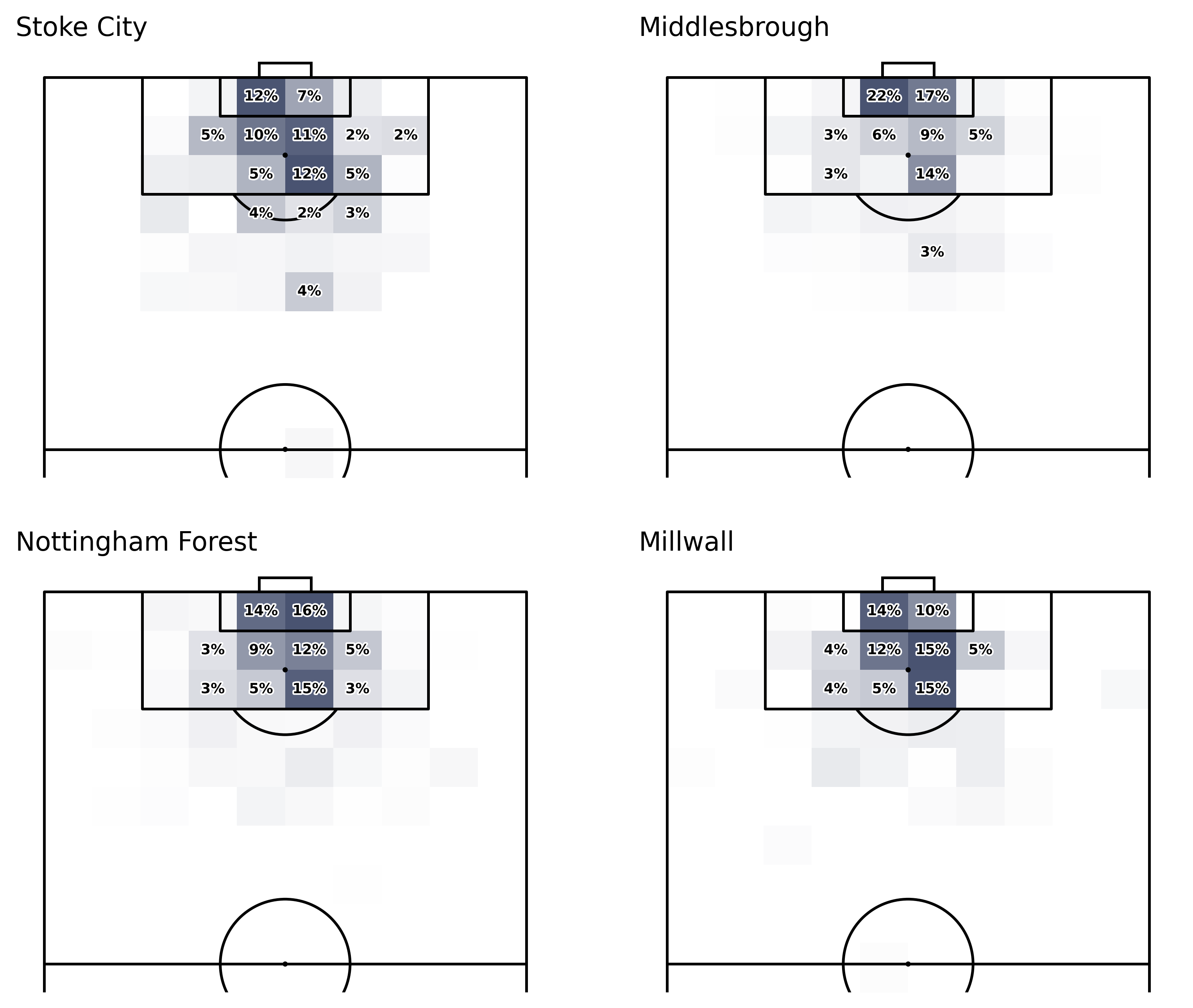
Pretty neat, don't you think?
That's it folks! Thanks so much for reading; if you enjoyed this tutorial, you could help me by subscribing and sharing my work. I hope this was useful to you in some way.
Catch you later 👋


